-
-
Vue视差标题背景
-
发表于: 2025-10-22 09:32 1224
-

一、说明
这个我是为了放在博客的标题部分作为背景图,上下滚动的时候比较好看。
原理就是通过几张透明的png进行叠加,然后在上下滚动时,外层png移动的快,内层png移动得慢来实现视差效果。
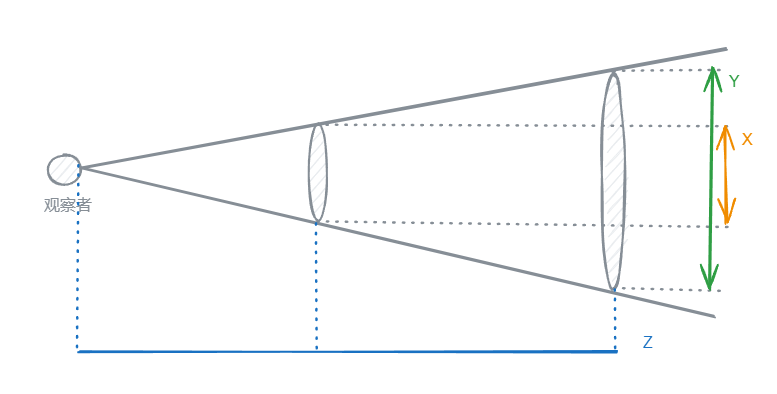
- 先放一张示意图:
这里实际的距离X和Y在观察者看来是一样的,原因是距离观察者的距离Z不一样导致的。
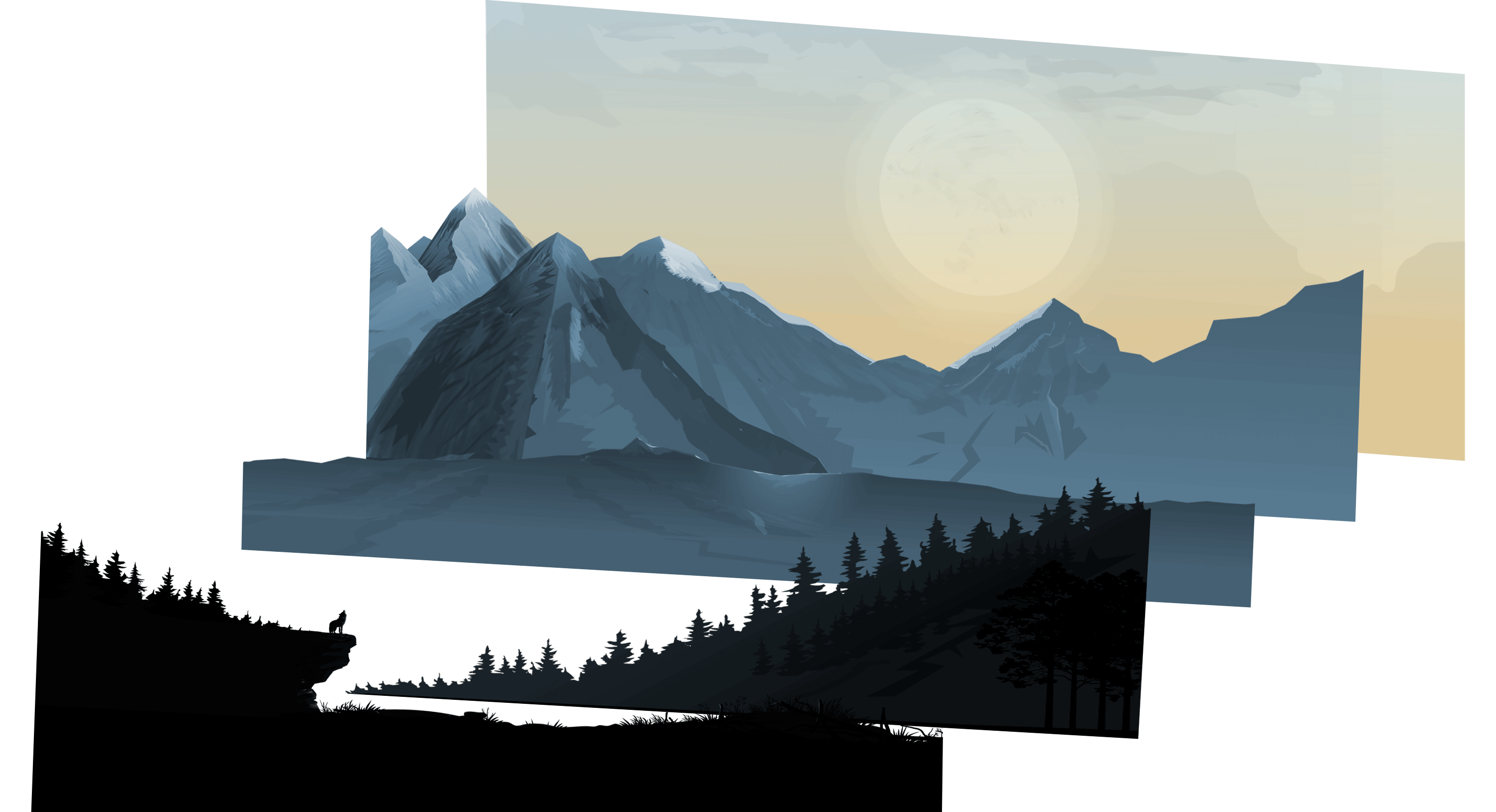
- 再放一张视差标题背景的3d示意图:
二、Vue代码
这里为了代码高亮分三部分展示
html部分
1 2 3 4 5 6 7 8 9 10 11 12 13 14 15 16 | <template> <section> <img :src="p0Src" id="p0" :style="{ transform: `translateY(${p0Top}px)`, zIndex: `100` }" alt="p0"> <img :src="p1Src" id="p1" :style="{ transform: `translateY(${p1Top}px)`, zIndex: `200` }" alt="p1"> <img :src="p2Src" id="p2" :style="{ transform: `translateY(${p2Top}px)`, zIndex: `300` }" alt="p2"> <img :src="p3Src" id="p3" :style="{ transform: `translateY(${p3Top}px)`, zIndex: `400` }" alt="p3"> <img :src="p4Src" id="p4" :style="{ transform: `translateY(${p4Top}px)`, zIndex: `500` }" alt="p4"> <img :src="p6Src" id="p6" :style="{ transform: `translateY(${p6Top}px)`, zIndex: `600` }" alt="p6"> <div id="banner_title" class="container" :style="{ marginRight: `0px`, marginTop: `${bannerTitleMarginTop}px`, width: `75%`}"> <h1>{{blogTitle}}</h1> <p class="description">{{blogDescription}}</p> </div> </section></template> |
js部分
1 2 3 4 5 6 7 8 9 10 11 12 13 14 15 16 17 18 19 20 21 22 23 24 25 26 27 28 29 30 31 32 33 34 35 36 37 38 39 40 41 42 43 44 45 46 47 48 49 50 51 52 53 54 55 56 57 58 59 60 61 62 63 64 65 66 67 | <script>const imgUrl = "https://xxxxxxxxxxxx/";export default { name: "Banner", data() { return { p0Src: imgUrl + 'banner/ppp0.png', p1Src: imgUrl + 'banner/pp1.png', p2Src: imgUrl + 'banner/pp2.png', p3Src: imgUrl + 'banner/pp3.png', p4Src: imgUrl + 'banner/pp4.png', p6Src: imgUrl + 'banner/pp6.png', p0Top: 0, p1Top: 0, p2Top: 0, p3Top: 0, p4Top: 0, p6Top: 0, bannerTitleMarginTop: -100, requestId: undefined, // 用于跟踪 requestAnimationFrame 的标识 }; }, props:{ blogTitle:{ type: String, require: true }, blogDescription:{ type: String, require: true }, }, mounted() { this.addScrollListener(); }, beforeDestroy() { this.removeScrollListener(); }, methods: { addScrollListener() { // 使用 passive 参数优化滚动性能 window.addEventListener('scroll', this.handleScroll, {passive: true}); }, removeScrollListener() { window.removeEventListener('scroll', this.handleScroll); }, handleScroll() { const value = window.scrollY; this.p0Top = value * 0.6; this.p1Top = value * 0.36; this.p2Top = value * 0.24; this.p3Top = value * 0.16; this.p4Top = value * 0.12; this.p6Top = 0; this.bannerTitleMarginTop = value * 1.1 - 100; // 使用 requestAnimationFrame 更新样式 if (this.requestId === undefined) { this.requestId = requestAnimationFrame(this.updateStyles); } }, updateStyles() { // 清除请求动画帧标识 this.requestId = undefined; } }}</script> |
style部分
1 2 3 4 5 6 7 8 9 10 11 12 13 14 15 16 17 18 19 20 21 22 23 24 25 26 27 28 29 30 31 32 33 34 35 36 37 38 39 40 41 42 43 44 45 46 47 48 49 50 51 52 53 54 55 56 57 58 59 60 61 62 63 64 65 66 67 68 69 70 71 72 73 74 75 76 | <style scoped lang="scss">section { position: relative; width: 100%; height: 100vh; padding: 0px; display: flex; justify-content: center; align-items: center; overflow: hidden; img { position: absolute; top: 0; left: 0; width: 100%; //height: 100%; object-fit: cover; pointer-events: none; will-change: transform; // 提前告知浏览器哪些属性可能会发生变化 } #p4,#p3,#p2,#p1,#p0 { width: 100%; height: 100%; } #p6 { width: 100%; height: 150%; } section::before { content: ''; position: absolute; bottom: 0; width: 100%; //height: 100px; background: linear-gradient(to top, #1c0522, transparent); //z-index: 1000; }}@-webkit-keyframes bounce { 0%,10%,25%,40%,50% { -webkit-transform: translateY(0) rotate(0deg); transform: translateY(0) rotate(0deg) } 20% { -webkit-transform: translateY(-10px) rotate(0deg); transform: translateY(-10px) rotate(0deg) } 30% { -webkit-transform: translateY(-5px) rotate(0deg); transform: translateY(-5px) rotate(0deg) }}@keyframes bounce { 0%,10%,25%,40%,50% { -webkit-transform: translateY(0) rotate(0deg); transform: translateY(0) rotate(0deg) } 20% { -webkit-transform: translateY(-10px) rotate(0deg); transform: translateY(-10px) rotate(0deg) } 30% { -webkit-transform: translateY(-5px) rotate(0deg); transform: translateY(-5px) rotate(0deg) }}</style> |
三、效果
可以点击七仔的博客然后上下缓慢滚动来查看效果。
[内核课程]《Windows内核攻防实战》!从零到实战,融合AI与Windows内核攻防全技术栈,打造具备自动化能力的内核开发高手。
赞赏
|
|
|---|---|
|
|

他的文章
- Vue视差标题背景 1224
- [原创]博客的加载速度和大小的优化、优化再优化 1359
- [原创]使用 Github Pages 和 Hexo 搭建博客 1336
- 给VitePress的右上角增加Github角标 1315
- [原创]【开源】七仔的桌面工具 v2.6.1 1562


赞赏
雪币:
留言:

